Rounded Corners and Shadows for Images using CSS

Here are some unique border styles that you can apply to blogger images by using the border-radius property and defining either all four corners simultaneously or applying the rounded border only to some of them.

One of the advantages of CSS3 is that we can apply rounded borders without complicating things too much and one of the options would be to use these edges or borders to images in the blog posts, to which we can also add some hover effects such as shading and rounded borders accompanied by transitions.

Note: if you need more info about how to add rounded corners on images, follow these links:
- CSS Basics. How to Apply Rounded Corners On Images #1
- CSS Basics. How to Apply Rounded Corners On Images #2

Below are a few examples of these borders and how the images behave when you hover over them.
If you want to use one of these styles, just copy the code below the image, then go to Template, click on the Edit HTML button and paste that code before ]]></b:skin> (CTRL + F to find it)
.post-body img {
border:0;
padding:0;
-moz-transition: all 1s;
-webkit-transition: all 1s;
-o-transition: all 1s;
}
.post-body img:hover {
box-shadow: 0px 0px 15px #000; /* Shadow */
border-radius: 50%; /* Rounded border */
-moz-transition: all 1s;
-webkit-transition: all 1s;
-o-transition: all 1s;
cursor:pointer;
}
.post-body img {
background:#FFF; /* background color around the image */
padding:15px; /* space between border and image */
-moz-transition: all 1s;
-webkit-transition: all 1s;
-o-transition: all 1s;
}
.post-body img:hover {
box-shadow: 0px 0px 15px #000; /* Shadow */
border-radius: 0% 50%; /* Rounded border */
-moz-transition: all 1s;
-webkit-transition: all 1s;
-o-transition: all 1s;
cursor:pointer;
}
.post-body img {
background:#FFF; /* the background color around the image */
padding:15px; /* The Space Between Border and Image */
border-radius: 50% 0; /* Rounded border */
box-shadow: 0px 0px 15px #000; /* Shadow */
-moz-transition: all 1s;
-webkit-transition: all 1s;
-o-transition: all 1s;
}
.post-body img:hover {
border-radius:0; /* This removes the border roundness (value 0) */
-moz-transition: all 1s;
-webkit-transition: all 1s;
-o-transition: all 1s;
cursor:pointer;
}
.post-body img {
box-shadow: 0px 0px 15px #000; /* Shadow */
border-radius: 50%; /* Rounded border */
border:0;
padding:0;
-moz-transition: all 1s;
-webkit-transition: all 1s;
-o-transition: all 1s;
}
.post-body img:hover {
box-shadow: 0; /* With this we remove the shadow (value 0) */
border-radius: 0; /* This removes the border roundness (value 0) */
-moz-transition: all 1s;
-webkit-transition: all 1s;
-o-transition: all 1s;
cursor:pointer;
}
.post-body img {
border-radius: 45% / 20%; /* Rounded border */
box-shadow: 0px 0px 15px #000; /* Shadow */
padding:0;
-moz-transition: all 1s;
-webkit-transition: all 1s;
-o-transition: all 1s;
}
.post-body img:hover {
border-radius: 0; /* This removes the roundness of border (value 0) */
-moz-transition: all 1s;
-webkit-transition: all 1s;
-o-transition: all 1s;
cursor:pointer;
}
So these effects will apply to all images uploaded to your Blogger posts. But if you want to apply them only on certain pictures then change .post-body img with .rounded  and .post-body img:hover with .rounded:hover
Then add the rounded class selector in the image's code:
<img class="rounded" src="Image URL"/>
These are just some examples, however, you can modify them anytime by adding or deleting more CSS styles, it depends on everybody's tastes or needs. But as you have seen, we can make the images look way more attractive and this has been done only with CSS ;)

How to make the background image of the blog fill the entire screen

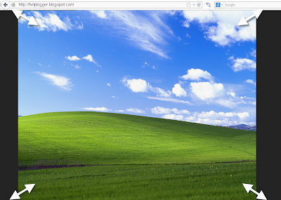
A constant question is how to make the background image of the blog always fill the entire screen regardless of the resolution of the monitor. And that is when we put a background image as measured by our monitor forgetting that there are actually monitors of all resolutions, very small and very large. So if we put an image according to our screen, there will be someone with a bigger monitor that surely will not see the whole picture or it will be repeated, and in this case, using very small monitors, the image will be seen incomplete.
blogger tricks, blogger tutorials, blogger blogspot

Here I will discuss two solutions to this, one using CSS3, and another with jQuery. With either of these two, we'll make the background image of the page to fill the entire screen regardless of the resolution of it.

CSS3


The first option is using CSS3, the advantage with this method is that we do not overload the blog with scripts, we use only the background-size property that is responsible for conducting what we want.
The disadvantage is that this property is supported only by modern browsers, so in the case of Internet Explorer, it will only be seen for version 9 and above, in other browsers there should be no problem.

The method is very simple, just go to Template - Edit HTML, locate the background that is within body { and replace it with this:
background: url(Image URL) no-repeat center center fixed;
background-size: cover;
It would look something like this:
body {
background: url(URL of the image) no-repeat center center fixed;
background-size: cover;
margin:0;
color:#000;
font:x-small Georgia Serif;
font-size/* */:/**/small;
font-size: /**/small;
text-align: center;
}
Just put the URL of the image and that's it.

jQuery


With this method we will use jQuery with BackStretch plugin, the advantage is that it works in all browsers, including IE7 and above. The disadvantage is not major if you already use jQuery, because the plugin is actually small.

To use this method in your blog, go to Template - Edit HTML and before </head> paste this script:
<script src='http://ajax.googleapis.com/ajax/libs/jquery/1.10.2/jquery.min.js' type='text/javascript'/>
<script type='text/javascript'>
//<![CDATA[
/*
* jQuery Backstretch
* Version 1.2.8
* http://srobbin.com/jquery-plugins/jquery-backstretch/
* Add a dynamically-resized background image to the page
* Copyright (c) 2012 Scott Robbin (srobbin.com)
* Licensed under the MIT license
* https://raw.github.com/srobbin/jquery-backstretch/master/LICENSE.txt
*/
;(function(a){a.backstretch=function(p,b,l){function s(){if(p){var b;0==c.length?c=a("<div />").attr("id","backstretch").css({left:0,top:0,position:m?"fixed":"absolute",overflow:"hidden",zIndex:-999999,margin:0,padding:0,height:"100%",width:"100%"}):c.find("img").addClass("deleteable");b=a("<img />").css({position:"absolute",display:"none",margin:0,padding:0,border:"none",zIndex:-999999,maxWidth:"none"}).bind("load",function(d){var b=a(this),e;b.css({width:"auto",height:"auto"});e=this.width||a(d.target).width();d=this.height||a(d.target).height();n=e/d;q();b.fadeIn(g.speed,function(){c.find(".deleteable").remove();"function"==typeof l&&l()})}).appendTo(c);0==a("body #backstretch").length&&(0===a(window).scrollTop()&&window.scrollTo(0,0),a("body").append(c));c.data("settings",g);b.attr("src",p);a(window).unbind("resize.backstretch").bind("resize.backstretch",function(){"onorientationchange"in window&&window.pageYOffset===0&&window.scrollTo(0,1);q()})}}function q(){try{j={left:0,top:0},rootWidth=h=o.width(),rootHeight=r?window.innerHeight:o.height(),f=h/n,f>=rootHeight?(k=(f-rootHeight)/2,g.centeredY&&(j.top="-"+k+"px")):(f=rootHeight,h=f*n,k=(h-rootWidth)/2,g.centeredX&&(j.left="-"+k+"px")),c.css({width:rootWidth,height:rootHeight}).find("img:not(.deleteable)").css({width:h,height:f}).css(j)}catch(a){}}var t={centeredX:!0,centeredY:!0,speed:0},c=a("#backstretch"),g=c.data("settings")||t;c.data("settings");var o,m,r,n,h,f,k,j;b&&"object"==typeof b&&a.extend(g,b);b&&"function"==typeof b&&(l=b);a(document).ready(function(){var b=window,d=navigator.userAgent,c=navigator.platform,e=d.match(/AppleWebKit\/([0-9]+)/),e=!!e&&e[1],f=d.match(/Fennec\/([0-9]+)/),f=!!f&&f[1],g=d.match(/Opera Mobi\/([0-9]+)/),h=!!g&&g[1],i=d.match(/MSIE ([0-9]+)/),i=!!i&&i[1];o=(m=!((-1<c.indexOf("iPhone")||-1<c.indexOf("iPad")||-1<c.indexOf("iPod"))&&e&&534>e||b.operamini&&"[object OperaMini]"==={}.toString.call(b.operamini)||g&&7458>h||-1<d.indexOf("Android")&&e&&533>e||f&&6>f||"palmGetResource"in window&&e&&534>e||-1<d.indexOf("MeeGo")&&-1<d.indexOf("NokiaBrowser/8.5.0")||i&&6>=i))?a(window):a(document);r=m&&window.innerHeight;s()});return this}})(jQuery);
//]]>
</script>
<script>
$.backstretch("URL of the image");
</script>

Put the URL of the image where indicated and ready.

As you can see both systems are easy to apply, each with its pros and cons, but the result is the same, extending the background image to fit the screen of any monitor regardless of the resolution of it.

Remember that in the case of jQuery method, you should verify that you are not using Mootools or Scriptaculous, if so you will have to implement some changes in the script to make it compatible.
And if you already use jQuery remember having only one version, the last one.