Showing posts with label how to. Show all posts

How To Add Snow In The Background of Your Blog Using CSS

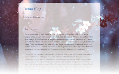
falling snow, snow, winter background, bloggerToday we’re going to go over a super simple CSS technique that you can use to make it snow on your Blogger blog. It seems particularly attractive since it doesn't require scripts, only CSS and three small images.

An advantage of this method is that by not using scripts doesn't overload the blog, the disadvantage is that users with not so modern browsers, will not be able to see it (in Internet Explorer works for version 10 and up).

The snow will fall in the background of the blog, which, in addition, prevent interfering with links or content (because the flakes are images), also prevent blocking the visibility of the content of the blog.

You can see the demo in this test blog.


How To Add Falling Snow To Blogger Blogspot

Step 1. Go to Template and click on the Edit HTML button:


Step 2. Click the small arrow on the left of <b:skin>...</b:skin> to expand the style (screenshot 1), then click anywhere inside the code area to search (using CTRL + F) for the ]]></b:skin> tag (screenshot 2) and add this code just above it:

/* Snow falling for Blogger
----------------------------------------------- */
@keyframes snow {
0% {background-position: 0px 0px, 0px 0px, 0px 0px;}
100% {background-position: 500px 1000px, 400px 400px, 300px 300px;}
}

@-moz-keyframes snow {
0% {background-position: 0px 0px, 0px 0px, 0px 0px;}
100% {background-position: 500px 1000px, 400px 400px, 300px 300px;}
}

@-webkit-keyframes snow {
0% {background-position: 0px 0px, 0px 0px, 0px 0px;}
100% {background-position: 500px 1000px, 400px 400px, 300px 300px;}
}

@-ms-keyframes snow {
0% {background-position: 0px 0px, 0px 0px, 0px 0px;}
100% {background-position: 500px 1000px, 400px 400px, 300px 300px;}
}

#falling-snow {
background-image: url(https://blogger.googleusercontent.com/img/b/R29vZ2xl/AVvXsEib1KBIV0mOU8e9YUuObd2NbTKyy68uZmbiz3RJq10cMB8qRLH3LrkBMdnOYS45ynBG9vuMJT3OY_TV6D5fOMNb8TGazllvlYNDR9zMvP0UaJBsrp11DXU9bZwIn1ETnMOLh29sZOAs5WeQ/s1600/snow.png), url(https://blogger.googleusercontent.com/img/b/R29vZ2xl/AVvXsEgg0yXjsMy5I87SJgQEY-8QkHBNcMYi3Sb4_3UgBR8Dd29DNPnVqHGtkMB3ikpXgBQuQ9BaBMrBJbpKNbDuhA3mIWX3gQcpBWST4JwvRlFZc3FkC7slHMcq-wD31DrNYPCX0QtDAVcm0CTB/s1600/snow3.png), url(https://blogger.googleusercontent.com/img/b/R29vZ2xl/AVvXsEhB0XxZfGylWMM4SNRsjtQDabQgTrszmioAzUplEQImvVoKEOtTBfav4oz4SYeyTccEiaKXXahfkFHyIt-OZgYGo0vstH9wholbDXVJ3lMWKYMxI5VYwVJjFmhSMhil_hRQRxWMBAAgNdZ-/s1600/snow2.png);
-webkit-animation: snow 20s linear infinite;
-moz-animation: snow 20s linear infinite;
-ms-animation: snow 20s linear infinite;
animation: snow 20s linear infinite;
}


Screenshot 1: 


Screenshot 2:


Step 3. Now, search (CTRL + F) for the <body> tag or this line:

<body expr:class='&quot;loading&quot; + data:blog.mobileClass'>

Step 4. And just below, add this:

<div id='falling-snow'>

Step 5. Finally, find the </body> tag (CTRL + F) and add the following just above it:

</div>

Step 6. Save the changes and that's it. Enjoy!!! :)

As you can see this tricks is very simple and easy to install, does not block the visibility of blog's content and the best is that it has no scripts, only CSS and nothing else.

Redirect Blogger 404 Error (Page Not Found) To Homepage

Whenever, by mistake, we or a user misspells an URL inexistent in our blog, it automatically redirects to the 404 error page (page not found). A message like this would appear:

"Sorry, the page you were looking for in this blog does not exist."

how to redirect blogger 404 error to homepage
And probably this will not make a good impression on the greatest potential users of our blog. Before the user clicks the back button or close the window/browser's tab, thus leaving our site forever, we may want to redirect 404 error in Blogger to a page, where are chances that the visitor will continue reading our blog.

One of the most used methods is the "meta refresh" but the problem with this method is that it breaks navigation (doesn't allow returning back). In this case, the best method is by using Javascript which will be shown below.

Redirect Blogger 404 Error with Javascript


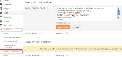
First of all, go to your Blogger dashboard and then to Settings > Search preferences > Custom Page Not Found.

redirect 404 error page in blogger to homepage

Copy and paste the following code:
Sorry, the page you're looking for in this blog does not exist.
You will be redirected to homepage shortly.
<script type = "text/javascript">
BSPNF_redirect = setTimeout(function() {
location.pathname= "/"
}, 5000);
</script>
The message which is going to be displayed can be edited as you want. If you are willing to redirect your blog 404 error page to another page other than your home page, just replace pathname to href and / with the url of your page. And finally, the number 5000 is the delay expressed in milliseconds. You can edit any value if this is more convenient.

Next thing to do is to save all changes made in this section and do a little test to check if the code works well. You can enter a nonexistent URL on your blog, and see if the 404 error page added previously appears, followed by a redirection after 5 seconds. That's it!

Create a Background Slideshow for Blogger

In the previous post we saw how to make the blog's background fill the screen regardless of the resolution of the monitor. The method that we'll use now with jQuery is a plugin called BackStretch which also has the option of creating a slideshow of pictures as a blog wallpaper without losing the property of adjusting to the width and height of the screen.

slideshow for blogger, blogger widgets

What we will do in this entry is just this, try to make the blog's background to have some images that are changing, all with fade effect between each transition.

You can see an example in this demo blog.

To put this slideshow in the blog's background, just go to Template - Edit HTML and before </head> add the following code:
<script src='http://ajax.googleapis.com/ajax/libs/jquery/1.10.2/jquery.min.js' type='text/javascript'/>
<script>
//<![CDATA[
/*
* jQuery Backstretch
* Version 1.2.8
* http://srobbin.com/jquery-plugins/jquery-backstretch/
* Add a dynamically-resized background image to the page
* Copyright (c) 2012 Scott Robbin (srobbin.com)
* Licensed under the MIT license
* https://raw.github.com/srobbin/jquery-backstretch/master/LICENSE.txt
*/
;(function(a){a.backstretch=function(p,b,l){function s(){if(p){var b;0==c.length?c=a("<div />").attr("id","backstretch").css({left:0,top:0,position:m?"fixed":"absolute",overflow:"hidden",zIndex:-999999,margin:0,padding:0,height:"100%",width:"100%"}):c.find("img").addClass("deleteable");b=a("<img />").css({position:"absolute",display:"none",margin:0,padding:0,border:"none",zIndex:-999999,maxWidth:"none"}).bind("load",function(d){var b=a(this),e;b.css({width:"auto",height:"auto"});e=this.width||a(d.target).width();d=this.height||a(d.target).height();n=e/d;q();b.fadeIn(g.speed,function(){c.find(".deleteable").remove();"function"==typeof l&&l()})}).appendTo(c);0==a("body #backstretch").length&&(0===a(window).scrollTop()&&window.scrollTo(0,0),a("body").append(c));c.data("settings",g);b.attr("src",p);a(window).unbind("resize.backstretch").bind("resize.backstretch",function(){"onorientationchange"in window&&window.pageYOffset===0&&window.scrollTo(0,1);q()})}}function q(){try{j={left:0,top:0},rootWidth=h=o.width(),rootHeight=r?window.innerHeight:o.height(),f=h/n,f>=rootHeight?(k=(f-rootHeight)/2,g.centeredY&&(j.top="-"+k+"px")):(f=rootHeight,h=f*n,k=(h-rootWidth)/2,g.centeredX&&(j.left="-"+k+"px")),c.css({width:rootWidth,height:rootHeight}).find("img:not(.deleteable)").css({width:h,height:f}).css(j)}catch(a){}}var t={centeredX:!0,centeredY:!0,speed:0},c=a("#backstretch"),g=c.data("settings")||t;c.data("settings");var o,m,r,n,h,f,k,j;b&&"object"==typeof b&&a.extend(g,b);b&&"function"==typeof b&&(l=b);a(document).ready(function(){var b=window,d=navigator.userAgent,c=navigator.platform,e=d.match(/AppleWebKit\/([0-9]+)/),e=!!e&&e[1],f=d.match(/Fennec\/([0-9]+)/),f=!!f&&f[1],g=d.match(/Opera Mobi\/([0-9]+)/),h=!!g&&g[1],i=d.match(/MSIE ([0-9]+)/),i=!!i&&i[1];o=(m=!((-1<c.indexOf("iPhone")||-1<c.indexOf("iPad")||-1<c.indexOf("iPod"))&&e&&534>e||b.operamini&&"[object OperaMini]"==={}.toString.call(b.operamini)||g&&7458>h||-1<d.indexOf("Android")&&e&&533>e||f&&6>f||"palmGetResource"in window&&e&&534>e||-1<d.indexOf("MeeGo")&&-1<d.indexOf("NokiaBrowser/8.5.0")||i&&6>=i))?a(window):a(document);r=m&&window.innerHeight;s()});return this}})(jQuery);
//]]>
</script>
<script>
//<![CDATA[
var images = [
 "Image URL",
 "Image URL",
 "Image URL",
 "Image URL",
 "Image URL",
  ];

  $(images).each(function(){
 $('<img/>')[0].src = this;
  });
  var index = 0;
$.backstretch(images[index], {speed: 1000});
  var slideshow = setInterval(function() {
  index = (index >= images.length - 1) ? 0 : index + 1;
    $.backstretch(images[index]);
  }, 5000);
//]]>
</script>
Here add the URLs of the images that will be the background of your blog.
If you would like to add more pictures, just add after the var images = [ another line like this:
 "Image URL",
The images will be changing in the order you have added them, if you want these to appear in a random order, then change the second part of the code with this:
<script>
//<![CDATA[
var images=new Array();
images[ 1 ]="Image URL";
images[ 2 ]="Image URL";
images[ 3 ]="Image URL";
images[ 4 ]="Image URL";
images[ 5 ]="Image URL";

  Array.prototype.shuffle = function() {
  var len = this.length;
  var i = len;
  while (i--) {
  var p = parseInt(Math.random()*len);
  var t = this[i];
  this[i] = this[p];
  this[p] = t;
  }
};

  images.shuffle();
  $(images).each(function(){
 $('<img/>')[0].src = this;
  });
  var index = 0;
$.backstretch(images[index], {speed: 1000});
  var slideshow = setInterval(function() {
  index = (index >= images.length - 1) ? 0 : index + 1;
    $.backstretch(images[index]);
  }, 5000);
//]]>
</script>
You can also add more pictures by adding a line like this:
images[ 6 ]="Image URL";
But you will see that in this case there are some consecutive numbers in blue, so if you add another such as 6, then the next one should be 7, etc..

In both cases you can change the duration of each image which is in the 5000 value that is at the end of the script.
The advantage of this slideshow in the blog's background is that images are automatically resized to the size of the monitor, so that, no matter of the resolution, it should look good.

It is worth remembering that if you are using Scriptaculous, you have to make some changes, and if you already use jQuery, should leave only one version.

Author page | Backstretch

Rounded Corners and Shadows for Images using CSS

Here are some unique border styles that you can apply to blogger images by using the border-radius property and defining either all four corners simultaneously or applying the rounded border only to some of them.

One of the advantages of CSS3 is that we can apply rounded borders without complicating things too much and one of the options would be to use these edges or borders to images in the blog posts, to which we can also add some hover effects such as shading and rounded borders accompanied by transitions.

Note: if you need more info about how to add rounded corners on images, follow these links:
- CSS Basics. How to Apply Rounded Corners On Images #1
- CSS Basics. How to Apply Rounded Corners On Images #2

Below are a few examples of these borders and how the images behave when you hover over them.
If you want to use one of these styles, just copy the code below the image, then go to Template, click on the Edit HTML button and paste that code before ]]></b:skin> (CTRL + F to find it)
.post-body img {
border:0;
padding:0;
-moz-transition: all 1s;
-webkit-transition: all 1s;
-o-transition: all 1s;
}
.post-body img:hover {
box-shadow: 0px 0px 15px #000; /* Shadow */
border-radius: 50%; /* Rounded border */
-moz-transition: all 1s;
-webkit-transition: all 1s;
-o-transition: all 1s;
cursor:pointer;
}
.post-body img {
background:#FFF; /* background color around the image */
padding:15px; /* space between border and image */
-moz-transition: all 1s;
-webkit-transition: all 1s;
-o-transition: all 1s;
}
.post-body img:hover {
box-shadow: 0px 0px 15px #000; /* Shadow */
border-radius: 0% 50%; /* Rounded border */
-moz-transition: all 1s;
-webkit-transition: all 1s;
-o-transition: all 1s;
cursor:pointer;
}
.post-body img {
background:#FFF; /* the background color around the image */
padding:15px; /* The Space Between Border and Image */
border-radius: 50% 0; /* Rounded border */
box-shadow: 0px 0px 15px #000; /* Shadow */
-moz-transition: all 1s;
-webkit-transition: all 1s;
-o-transition: all 1s;
}
.post-body img:hover {
border-radius:0; /* This removes the border roundness (value 0) */
-moz-transition: all 1s;
-webkit-transition: all 1s;
-o-transition: all 1s;
cursor:pointer;
}
.post-body img {
box-shadow: 0px 0px 15px #000; /* Shadow */
border-radius: 50%; /* Rounded border */
border:0;
padding:0;
-moz-transition: all 1s;
-webkit-transition: all 1s;
-o-transition: all 1s;
}
.post-body img:hover {
box-shadow: 0; /* With this we remove the shadow (value 0) */
border-radius: 0; /* This removes the border roundness (value 0) */
-moz-transition: all 1s;
-webkit-transition: all 1s;
-o-transition: all 1s;
cursor:pointer;
}
.post-body img {
border-radius: 45% / 20%; /* Rounded border */
box-shadow: 0px 0px 15px #000; /* Shadow */
padding:0;
-moz-transition: all 1s;
-webkit-transition: all 1s;
-o-transition: all 1s;
}
.post-body img:hover {
border-radius: 0; /* This removes the roundness of border (value 0) */
-moz-transition: all 1s;
-webkit-transition: all 1s;
-o-transition: all 1s;
cursor:pointer;
}
So these effects will apply to all images uploaded to your Blogger posts. But if you want to apply them only on certain pictures then change .post-body img with .rounded  and .post-body img:hover with .rounded:hover
Then add the rounded class selector in the image's code:
<img class="rounded" src="Image URL"/>
These are just some examples, however, you can modify them anytime by adding or deleting more CSS styles, it depends on everybody's tastes or needs. But as you have seen, we can make the images look way more attractive and this has been done only with CSS ;)

How to make the background image of the blog fill the entire screen

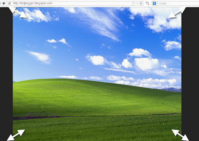
A constant question is how to make the background image of the blog always fill the entire screen regardless of the resolution of the monitor. And that is when we put a background image as measured by our monitor forgetting that there are actually monitors of all resolutions, very small and very large. So if we put an image according to our screen, there will be someone with a bigger monitor that surely will not see the whole picture or it will be repeated, and in this case, using very small monitors, the image will be seen incomplete.
blogger tricks, blogger tutorials, blogger blogspot

Here I will discuss two solutions to this, one using CSS3, and another with jQuery. With either of these two, we'll make the background image of the page to fill the entire screen regardless of the resolution of it.

CSS3


The first option is using CSS3, the advantage with this method is that we do not overload the blog with scripts, we use only the background-size property that is responsible for conducting what we want.
The disadvantage is that this property is supported only by modern browsers, so in the case of Internet Explorer, it will only be seen for version 9 and above, in other browsers there should be no problem.

The method is very simple, just go to Template - Edit HTML, locate the background that is within body { and replace it with this:
background: url(Image URL) no-repeat center center fixed;
background-size: cover;
It would look something like this:
body {
background: url(URL of the image) no-repeat center center fixed;
background-size: cover;
margin:0;
color:#000;
font:x-small Georgia Serif;
font-size/* */:/**/small;
font-size: /**/small;
text-align: center;
}
Just put the URL of the image and that's it.

jQuery


With this method we will use jQuery with BackStretch plugin, the advantage is that it works in all browsers, including IE7 and above. The disadvantage is not major if you already use jQuery, because the plugin is actually small.

To use this method in your blog, go to Template - Edit HTML and before </head> paste this script:
<script src='http://ajax.googleapis.com/ajax/libs/jquery/1.10.2/jquery.min.js' type='text/javascript'/>
<script type='text/javascript'>
//<![CDATA[
/*
* jQuery Backstretch
* Version 1.2.8
* http://srobbin.com/jquery-plugins/jquery-backstretch/
* Add a dynamically-resized background image to the page
* Copyright (c) 2012 Scott Robbin (srobbin.com)
* Licensed under the MIT license
* https://raw.github.com/srobbin/jquery-backstretch/master/LICENSE.txt
*/
;(function(a){a.backstretch=function(p,b,l){function s(){if(p){var b;0==c.length?c=a("<div />").attr("id","backstretch").css({left:0,top:0,position:m?"fixed":"absolute",overflow:"hidden",zIndex:-999999,margin:0,padding:0,height:"100%",width:"100%"}):c.find("img").addClass("deleteable");b=a("<img />").css({position:"absolute",display:"none",margin:0,padding:0,border:"none",zIndex:-999999,maxWidth:"none"}).bind("load",function(d){var b=a(this),e;b.css({width:"auto",height:"auto"});e=this.width||a(d.target).width();d=this.height||a(d.target).height();n=e/d;q();b.fadeIn(g.speed,function(){c.find(".deleteable").remove();"function"==typeof l&&l()})}).appendTo(c);0==a("body #backstretch").length&&(0===a(window).scrollTop()&&window.scrollTo(0,0),a("body").append(c));c.data("settings",g);b.attr("src",p);a(window).unbind("resize.backstretch").bind("resize.backstretch",function(){"onorientationchange"in window&&window.pageYOffset===0&&window.scrollTo(0,1);q()})}}function q(){try{j={left:0,top:0},rootWidth=h=o.width(),rootHeight=r?window.innerHeight:o.height(),f=h/n,f>=rootHeight?(k=(f-rootHeight)/2,g.centeredY&&(j.top="-"+k+"px")):(f=rootHeight,h=f*n,k=(h-rootWidth)/2,g.centeredX&&(j.left="-"+k+"px")),c.css({width:rootWidth,height:rootHeight}).find("img:not(.deleteable)").css({width:h,height:f}).css(j)}catch(a){}}var t={centeredX:!0,centeredY:!0,speed:0},c=a("#backstretch"),g=c.data("settings")||t;c.data("settings");var o,m,r,n,h,f,k,j;b&&"object"==typeof b&&a.extend(g,b);b&&"function"==typeof b&&(l=b);a(document).ready(function(){var b=window,d=navigator.userAgent,c=navigator.platform,e=d.match(/AppleWebKit\/([0-9]+)/),e=!!e&&e[1],f=d.match(/Fennec\/([0-9]+)/),f=!!f&&f[1],g=d.match(/Opera Mobi\/([0-9]+)/),h=!!g&&g[1],i=d.match(/MSIE ([0-9]+)/),i=!!i&&i[1];o=(m=!((-1<c.indexOf("iPhone")||-1<c.indexOf("iPad")||-1<c.indexOf("iPod"))&&e&&534>e||b.operamini&&"[object OperaMini]"==={}.toString.call(b.operamini)||g&&7458>h||-1<d.indexOf("Android")&&e&&533>e||f&&6>f||"palmGetResource"in window&&e&&534>e||-1<d.indexOf("MeeGo")&&-1<d.indexOf("NokiaBrowser/8.5.0")||i&&6>=i))?a(window):a(document);r=m&&window.innerHeight;s()});return this}})(jQuery);
//]]>
</script>
<script>
$.backstretch("URL of the image");
</script>

Put the URL of the image where indicated and ready.

As you can see both systems are easy to apply, each with its pros and cons, but the result is the same, extending the background image to fit the screen of any monitor regardless of the resolution of it.

Remember that in the case of jQuery method, you should verify that you are not using Mootools or Scriptaculous, if so you will have to implement some changes in the script to make it compatible.
And if you already use jQuery remember having only one version, the last one.

Making a gadget visible only to the blog administrator

And the post title says it all. There are gadgets that sometimes we want to be visible only to us and not to our blog readers, perhaps a Survey already ended that we want to keep, a counter, or any gadget that while we customize, we don't want anyone else to see until the final result is ready.
blogger widgets, blogger tutorials
 The procedure is simple, we just have to add two lines to our gadget that we want to hide.

First thing to do is to go to Template > Edit HTML and then search for the gadget's code we want to hide. It will be easier using the CTRL + F keys and locating the name of the gadget/widget.

For example, in a HTML/Javascript gadget, we will see a code like this:
<b:widget id='HTML1' locked='false' title='' type='HTML'>
<b:includable id='main'>
<span class='item-control blog-admin'>
<!-- only display title if it's non-empty -->
<b:if cond='data:title != &quot;&quot;'>
<h2 class='title'><data:title/></h2>
</b:if>
<div class='widget-content'>
<data:content/>
</div>

<b:include name='quickedit'/>
</span>
</b:includable>
</b:widget>
All you have to do is add the parts in red and ready. If you close the session go to your blog you'll not be able to view the gadget that you have hidden, but as soon as you sign in you will see that it is visible to you.

Not all gadgets have the same structure like in my example, but it will be easier to guide you, just place the first code in red just after <b:includable id='main'>

And the second red code just before </b:includable>
Note: to look inside the widget's code, click on the sideways arrow next to the widget's id.

And with that the gadget will be hidden for readers except you.

Upload images and get the URL of the image

As each day there are lots of new users joining the world of blogging, is necessary to discuss about some basic topics that bring up some recurring questions such as how we could get the URL of an image?

On the Internet there are many both free as well as paid web hosting where we can host images, but since we use Blogger then there is nothing better than using the same hosting service that Google gives us and that is Picasa.

The fastest way to upload an image is by going to the Blogger post editor. From your Blogger Dashboard, go to your blog, then click on the New post button. And preferably from the Edit HTML tab, click on the image icon.

A pop-up window will open, then click on the Choose files button, browse for your image(s), double click or click on Open and then hit Add selected.

When you have uploaded you will see that in the post editor shows the code of the image.


That code is the URL of the image. You'll see two URLs (Web addresses):
<a href="https://blogger.googleusercontent.com/img/b/R29vZ2xl/AVvXsEg8X52Vj9MVHq-e_SiIrqrYOgHCnY3LlzktcKrBaJ4eIei6iNQdL7DQSEzF-ZR_pgwYap8UD2Z3IW5i7EPNVoI9e7qgA-QtTbMGOoZq-HVZ2AXgR1TojBhV8REYWhn9tO0nXiHh6nX5bhUQ/s1600/Bliss-Windows-XP.png" imageanchor="1"><img border="0" src="https://blogger.googleusercontent.com/img/b/R29vZ2xl/AVvXsEg8X52Vj9MVHq-e_SiIrqrYOgHCnY3LlzktcKrBaJ4eIei6iNQdL7DQSEzF-ZR_pgwYap8UD2Z3IW5i7EPNVoI9e7qgA-QtTbMGOoZq-HVZ2AXgR1TojBhV8REYWhn9tO0nXiHh6nX5bhUQ/s320/Bliss-Windows-XP.png" /></a>

The first is the URL of the image that you need to take. It is not necessary to publish this entry where you uploaded the picture, you could as well not publish it, leave it as a draft or delete it, the image will be saved anyway on PicasaWeb (unless when you removed the draft, you have also selected the image to remove). You could also upload image directly from Picasa. Just login to PicasaWeb, select the album where you want to host the image, and click on Add photos.


Select the image from your computer and upload it.


After we have uploaded, click on OK.

There you will see the thumbnail, along with other photos, if there are more.

If you want to get the URL of the image from Picasa then click on the image to open in full size.
With the right mouse button click on the picture and select option depending on the browser you use...

If using Google Chrome, then select Copy Image URL:


If you are using Mozilla Firefox select Copy Image Location:


If you are using Opera select Copy Image URL:


If you are using Safari select Copy Image Address:


If you are using Internet Explorer (I hope not), first select Properties, a window will open, there you will find the Address section from where you can select the URL of the image and copy it:


Having selected any of these options you'll have in the clipboard the URL of the image. Simple isn't it?

Remember that all images you upload on Blogger are stored in your Picasa account, so if you find an image previously uploaded to your blog, go to your Picasa account, select the album containing the name of your blog and there find the picture you need. The procedure to obtain the URL of the image is the same as explained above.

Fade In/Out Page Loading Effect On Blogger Posts

A very common effect in jQuery is the fade effect that hides or shows an element by fading it, and we can use it in many ways as for example in the blog's navigation. The following script does just that, by loading the page with a fading effect when we browse on internal links that are in the blog, such as post titles, labels links, archive, navigation links, etc..
jQuery effect, fade in effect, blogger jQuery
You can see an example in this demo blog, click on the title of any post and see the fading effect when the page is loading.

How To Implement the Fade In Loading Effect

1) To put this fading effect on your blog, go to your Template > Edit HTML :

fading effect, blogger blogspot, blogger tricks

2) Click anywhere inside the code area and search for the </head> tag using CTRL + F keys:


3) Then, just above </head> add the following code:
<script src='http://ajax.googleapis.com/ajax/libs/jquery/1.8.2/jquery.min.js' type='text/javascript'/>
<script type='text/javascript'>
//<![CDATA[
$(document).ready(function() {
$("body").css("z-index", "-10");
$("body").fadeIn(0);

$("a").click(function(event){
event.preventDefault();
linkLocation = this.href;
$("body").fadeOut(500, redirectPage); });
function redirectPage() {
window.location = linkLocation;
}
});
//]]>
</script>
<style>
html {
background-color: #F2F2F2; /* Color fading */
}
</style>
4) Save the changes and that's it. In green you can see where to change the color that fades on a loading page.

The original script hides the body of the page while loading, I prefer to change that property with a negative z-index to avoid problems with the search engine robots that may effect the positioning.

Problems?

Consider that such effects could increase the blog loading time, so I recommend using it only when your blog loads fast and does not have too many scripts.

If you already use another version of jQuery remove the other, leaving only this which will be readed first.

If you are using Mootools or Scriptaculous, then you have to make some modifications to the code in order to be compatible.

If you have another script with a fade effect, then it could interfere with this and you might not see anything on the page except the color fading, in such cases it is better without this script.

You can also use this effect only on some links, for example, if you want to appear only when you click on the post titles in the navigation links (older posts and newer posts), and on the top tabs, then replace this line:
$("a").click(function(event){
With this:
$(".post-title a, .blog-pager-older-link, .blog-pager-newer-link, .tabs").click(function(event){
In some cases, the page can load for a second and then load with the fade effect, this may be "normal" because the browser is slow to read the script on page load.

Apart from these drawbacks, I think it's a very elegant way to load blog pages while browsing them, don't you think?

Using the :before and :after Pseudo Elements on Sidebar Titles

This is another method of using the :after and :before properties and it will work without too many problems in any browser, including IE8. What this trick will do is to divide the header bar into left and right sections, where the left will contain an explanatory title and the right, a related link.

The idea of generating Adobe-like Arrow Headers was actually discussed by css-tricks and adapted to Blogger.

How to Add Adobe-like Headers to Blogger

blogger gadgets, blogger tricks, blogger blogspot

Step 1. Log in to your Blogger dashboard > go to Template > Edit HTML, then click anywhere inside the code area to search - using the CTRL + F keys - for the following tag:
</head>
Step 2. Just above it, copy and paste this code:
 <style>
.module h2 {
  background-color: #D5D5D5;
  border-radius: 20px 0 0 20px;
  color: #FFFFFF;
  font-family: Verdana;
  font-size: 14px;
  line-height: 32px;
  margin: 0;
  padding: 0 0 0 20px;
  text-shadow: 2px 1px 1px #222;
}

.module h2 a {
    border-left: 5px solid #ffffff;
    color: #101921;
    float: right;
    font-size: 14px;
    text-decoration: none;
    text-shadow: none;
    padding: 0 10px;
    position: relative;
   -moz-transition: padding 0.1s linear;
   -webkit-transition: padding 0.1s linear;
   -ms-transition: padding 0.1s linear;
   -o-transition: padding 0.1s linear;
}
.module h2 a:hover {
  padding: 0 32px;
}

.module h2 a:before, .module h2 a:after {
    content: &quot;&quot;;
    height: 0;
    position: absolute;
    top: 50%;
    width: 0;
}
.module h2 a:before {
    border-bottom: 8px solid transparent;
    border-right: 8px solid #ffffff;
    border-top: 8px solid transparent;
    left: -12px;
    margin-top: -8px;
}
.module h2 a:after {
    border-bottom: 6px solid transparent;
    border-top: 6px solid transparent;
    left: -6px;
    margin-top: -6px;
}

.module.blue h2 a {background-color: #A2D5EC;}
.module.blue h2 a:hover {background-color: #C5F0FF;}
.module.blue h2 a:after {border-right: 6px solid #A2D5EC;}
.module.blue h2 a:hover:after {border-right-color: #C5F0FF;}

.module.yellow h2 a {background-color: #FCE98D;}
.module.yellow h2 a:hover {background-color: #FFD700;}
.module.yellow h2 a:after {border-right: 6px solid #FCE98D;}
.module.yellow h2 a:hover:after {border-right-color: #FFD700;}

.module.green h2 a {background-color: #bada55;}
.module.green h2 a:hover {background: #C7E176;}
.module.green h2 a:after {border-right: 6px solid #bada55;}
.module.green h2 a:hover:after {border-right-color: #C7E176;}

.module.red h2 a {background-color: #F0A5B5;}
.module.red h2 a:hover {background-color: #FFC7D2;}
.module.red h2 a:after {border-right: 6px solid #F0A5B5;}
.module.red h2 a:hover:after {border-right-color: #FFC7D2;}
</style>
Step 3. Save the Template.

Screenshot:


Step 4. Now go to Layout and Add a new HTML/JavaScript Gadget with one of the codes below for each of the widget title:

Background in blue:
<div class="module blue">
<h2>Title in <a href="Link URL">Blue</a></h2>
</div>
Background in yellow:
<div class="module yellow">
<h2>Title in <a href="Link URL">Yellow</a></h2>
</div>
Background in green:
<div class="module green">
<h2>Title in <a href="Link URL">Green</a></h2>
</div>
Background in red:
<div class="module red">
<h2>Title in <a href="Link URL">Red</a></h2>
</div>

Note: Change "Title in" text with your widget's title and Blue, Yellow, Green and Red with the text on the right, then add a Link URL to it.

Step 5. After you saved the HTML/Javascript gadgets containing the codes above, drag and drop them just above the widgets you want to show... and Save the Arrangement.
blogger tricks, blogger tutorials

DEMO

You can see how the sidebar titles has been replaced with some cool header bars on this demo blog.

Multi Hover Effect On Blogger Images Using Pure CSS

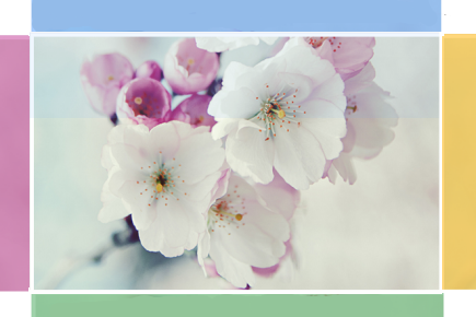
Today I'm going to show you how to add an amazing mouseover effect for Blogger images using only CSS, in which moving your mouse over an image from different directions (from above, from below, etc) will cause an overlay transitioned in from the same vector. This trick will change not only the images appearance when moving mouse over them, but will also allow you to add inside a text with a description.

hover effect, mouseover, blogger hover effects

You can see the effect on this image below: try moving your mouse from the left, right, and above.

hover right hover top hover left hover bottom

Adding Hover Effect From Different Directions on Blogger Images

First thing to do is to add the CSS style to our Template:

Step 1. From Blogger Dashboard, go to Template and press the Edit HTML button


Step 2. Search for the </head> tag - to find it, click anywhere inside the code area, press CTRL + F keys and type it in the search box.


Step 3. After you found it, add the following style just above it: 
<style>
  /* The container and the image */
  div.multi-hover {
    overflow: hidden;
    position: relative;
    vertical-align: middle;
    width: 100%;
    height: 358px;
    line-height: 358px;
  }
  div.multi-hover img {width: 100%;}

/* The texts that, by default, are hidden */
  div.multi-hover span {
    color: #FFF;
    font-size: 32px;
    font-weight: bold;
    height: 100%;
    opacity: 0;
    position: absolute;
    text-align: center;
    transition: all 0.3s linear 0s;
    width: 100%;
  }

/* And this is what will generate the effect */
  div.multi-hover span:nth-child(1) { /* right */
    background: none repeat scroll 0 0 rgba(255, 189, 36, 0.6);
    left: 90%;
    top: 0;
  }
  div.multi-hover span:nth-child(2) { /* top */
    background: none repeat scroll 0 0 rgba(106, 170, 255, 0.6);
    left: 0;
    top: -80%;
  }
  div.multi-hover span:nth-child(3) { /* left */
    background: none repeat scroll 0 0 rgba(204, 87, 166, 0.6);
    left: -90%;
    top: 0;
  }
  div.multi-hover span:nth-child(4) { /* bottom */
    background: none repeat scroll 0 0  rgba(97, 181, 115, 0.6);
    left: 0;
    top: 80%;
  }

  div.multi-hover span:hover {opacity: 1;}
  div.multi-hover span:nth-child(2n+1):hover {left: 0;}
  div.multi-hover span:nth-child(2n):hover {top: 0;}

</style>
Step 4. Save the Template

Now we are going to add the HTML that is nothing but a DIV where we included four SPAN tags with texts and an image:

Step 5. Choose Posts, create a New Post, click on the HTML tab (1) and paste this code inside the empty box:
<div class=multi-hover>
  <span>hover right</span>
  <span>hover top</span>
  <span>hover left</span>
  <span>hover bottom</span>
  <img src="https://blogger.googleusercontent.com/img/b/R29vZ2xl/AVvXsEgyq7zq-lrimQGQXADn-y3o_6bWPZB-W578mDgqC2obq-sf3jlpi56_6s333eV06L77ISq5qbHNuyDBaxScqwm4_Xu3Q82yNmSmmAOx9JZOZJq1l53K-4AwWNk8SP4fe44bB3mQVXyFy1g/s1600/flowers">
</div>
Add your own text/description to "hover right", "hover top", "hover left" and "hover bottom" (2) and replace the url in blue with the image URL (3) where you want to apply the effect.

Important! Do not click on the Compose tab, otherwise the changes will be lost.


Step 6. After you finished editing your post, click Publish (4)

And that's it... enjoy! :)

How To Add Social Media Icons to Blogger Header

social media icons, facebook icons, social media icons for bloggerThis tutorial will help you to add social media icons in the top right corner of the page which could increases the likelihood that readers can follow through the various social networks. There are several ways to do this, like adding a new widget section to the blog header but now, we'll do it using an unordered list that uses icons of Facebook, Twitter, Google+ and blog feed, and as a bonus, the icons will rotate when you hover over them.

You can see a demo in this test blog.


Adding Social Media Icons to Blogger Header

Step 1. From your Blogger dashboard, go to Template and click on the Edit HTML button:

blogger blogspot, blogger template, blogger gadgets

Step 2. To expand the style, click on the small arrow on the left of <b:skin>...</b:skin> (screenshot 1), then click anywhere inside the code area to search (using CTRL + F) for the ]]></b:skin> tag (screenshot 2) and add this code just above it:

 /* Social icons for Blogger
----------------------------------------------- */

#social-icons {
margin-bottom:-30px;
height:50px;
width:100%;
display:block;
clear:both;
z-index: 2;
position: relative;
}
.social-media-icons {
display:table
}
.social-media-icons ul {
text-align:right;
padding:5px 5px 0 0
list-style-image:none;
list-style-position:outside;
list-style-type:none;
}
.social-media-icons ul {
margin-bottom:0;
padding:0;
float:right;
}
.social-media-icons li.media_icon {
margin-left:6px;
padding-left:0 !important;
background:none !important;
display:inline;
float:left;
}
.social-media-icons li:hover {
-moz-transform: rotate(360deg);
-webkit-transform: rotate(360deg);
-o-transform: rotate(360deg);
transform: rotate(-360deg);
-moz-transition: all 0.5s ease-in-out;
-webkit-transition: all 0.5s ease-in-out;
-o-transition: all 0.5s ease-in-out;
-ms-transition: all 0.5s ease-in-out;
transition: all 0.5s ease-in-out;
}

Screenshot 1:


Screenshot 2:


Step 3. Now search for this line

<b:section class='header' id='header' maxwidgets='1' showaddelement='no'>

Step 4. And just above it, add this code:

<div class='social-media-icons' id='social-icons'>
<ul>

<li class='media_icon'><a href='http://facebook.com/username'><img border='0' src='https://blogger.googleusercontent.com/img/b/R29vZ2xl/AVvXsEhGBQMll4gcrfxhkO7k7w5qhq9m4hQSBnHa4ogOiy6J1k1kkOWhx6XZBbGWBHZdokPT8VKC9UkMW6Bw9upWzQk50oNZ5wF3R7cWTmG6WRv-Gxjzbm0qnv72obxlT658e3WcijFalqipjjk/s1600/Facebook.png'/></a></li>

<li class='media_icon'><a href='http://twitter.com/#!/username'><img border='0' src='https://blogger.googleusercontent.com/img/b/R29vZ2xl/AVvXsEgkxOQcbCLP3NXd1tHMCqLS1wB-tbTcOs-yZ01oVNDCz9CKNMIoRP8LXOs1mBbNsy1-_KWlBGSmYsuTKzgMpbQWMKLovn-It6eYcuLPQf68BnM8I5IocKKNRWMhpYiIl9HJ8fvTnhyphenhyphenOTQw/s1600/Twitter.png'/></a></li>

<li class='media_icon'><a href='https://plus.google.com/XXXXXXXXXXXXXXXXXX/about'><img border='0' src='https://blogger.googleusercontent.com/img/b/R29vZ2xl/AVvXsEjJ1W8szWRABXcynyfwHKJKyVsj73OVpy1NyOxpfugNuFlpGKWTh_j0MgV-sQ_cx-Y4sLLOeFEuM8fhyphenhyphenaLVHrJd6hpSRGHa_Fg8cvv40CK7riNl-7Q57na20W2Xulm55VW2cBGkXI-NELw/s1600/googleplus.png'/></a></li>

<li class='media_icon'><a href='http://name-of-your-blog.com/feeds/posts/default'><img border='0' src='https://blogger.googleusercontent.com/img/b/R29vZ2xl/AVvXsEhN4uT3GiuGu1-G_ng2NHkVpV14yofvdnvGmFETZvmv7oYZbjrcsuEftiQ7Ed8odFCxsm-bFX_myF4mCxW5nw_PrqWH9ank3YmQIRpqCjh5LCuZapFly2yNTpWH7WUWSRpApkt1wjruSh8/s1600/RSS.png'/></a></li>

</ul></div>

Customization

- Change what's in red with your usernames and id: the first is your Facebook username, the second is that of Twitter, in the third you should change the X by the ID of your Google+ profile and in the fourth you will put the name of your blog.
- To change the icons, just replace the urls in blue with the ones of your images.
- You can add more icons if you want, you just have to add before </ul></div> a line like this for each extra icon you want:

<li class='media_icon'><a href='Link URL'><img border='0' src='Image URL'/></a></li>

Step 5. Finally, Save the Template to apply the changes.

The effect is done with CSS3, so this effect will not work in older browsers.

How To Add A Tabbed Navigation Widget to Blogger

The tabviews are elements that allow us to group in a single container various gadgets and these can be selected via tabs.
Its main function is to save space on the blog to avoid scattered gadgets in the same category so you can group multiple gadgets into one. There are several methods for creating tabviews, some require jQuery, other MooTools, or any other script.
To add this widget to your blog, just follow the steps below:

Step 1. From your Blogger Dashboard, go to Template and click on the Edit HTML button

Step 2. Expand the style of the template, by clicking on the sideways arrow before <b:skin> ... </b:skin>


Step 3. Search using CTRL + F for the following tag:

]]></b:skin>


Step 4. Just above it, add the following code:

/* Tabview for Blogger
----------------------------------------------- */
.tabviewcont{
margin:15px 0;
padding:0;
clear:both;
}

.tabviewnav {
margin: 0 0 0 14px;
padding:3px 0; /* If you are using a Blogger Template change 0 with 15px */
font-size:12px; /* Font size of text inside tabs */
font-weight:bold;
}
.tabviewnav li {
list-style:none;
margin:0;
display:inline;
}
.tabviewnav li a {
padding:3px 6px;
margin-right:1px;
background:#F6F6F6; /* The background color of the tabs */
border-radius:5px 5px 0 0;
-moz-border-radius:5px 5px 0 0;
-webkit-border-radius:5px 5px 0 0;
text-decoration:none;
color:#222222;
}
.tabviewnav li a:hover {
color:#222222;
background:#EBEBEB; /* Background color of the tab on mouseover */
text-decoration:none;
}
.tabviewnav li.tabviewactive a,
.tabviewnav li.tabviewactive a:hover {
background:#EBEBEB; /* Background color of the active tab */
color:#222222;
}
.tabviewcont .tabviewtab {
padding:5px;
border:1px solid #EEEEEE; /* Border around the container */
background:#fff; /* The background color of the gadget */
}
.tabviewcont .tabviewtab h2,
.tabviewcont .tabviewtabhide {
display:none;
}
.tabviewtab .widget-content ul{
list-style:none;
margin:0 0 10px 0;
padding:0;
}
.tabviewtab .widget-content li {
border-bottom:1px solid #ccc;
margin:0 5px;
padding:2px 0 5px 0;
}

Step 5. Find the </head> tag and just above it, paste this script:

<script type='text/javascript'>
// Tabview for grouping gadgets

//<![CDATA[
document.write('<style type="text/css">.tabview{display:none;}<\/style>');function tabviewObj(argsObj){var arg;this.div=null;this.classMain="tabview";this.classMainLive="tabviewcont";this.classTab="tabviewtab";this.classTabDefault="tabviewtabdefault";this.classNav="tabviewnav";this.classTabHide="tabviewtabhide";this.classNavActive="tabviewactive";this.titleElements=['h2','h3','h4','h5','h6'];this.titleElementsStripHTML=true;this.removeTitle=true;this.addLinkId=false;this.linkIdFormat='<tabviewid>nav<tabnumberone>';for(arg in argsObj){this[arg]=argsObj[arg]}this.REclassMain=new RegExp('\\b'+this.classMain+'\\b','gi');this.REclassMainLive=new RegExp('\\b'+this.classMainLive+'\\b','gi');this.REclassTab=new RegExp('\\b'+this.classTab+'\\b','gi');this.REclassTabDefault=new RegExp('\\b'+this.classTabDefault+'\\b','gi');this.REclassTabHide=new RegExp('\\b'+this.classTabHide+'\\b','gi');this.tabs=new Array();if(this.div){this.init(this.div);this.div=null}}tabviewObj.prototype.init=function(e){var childNodes,i,i2,t,defaultTab=0,DOM_ul,DOM_li,DOM_a,aId,headingElement;if(!document.getElementsByTagName){return false}if(e.id){this.id=e.id}this.tabs.length=0;childNodes=e.childNodes;for(i=0;i<childNodes.length;i++){if(childNodes[i].className&&childNodes[i].className.match(this.REclassTab)){t=new Object();t.div=childNodes[i];this.tabs[this.tabs.length]=t;if(childNodes[i].className.match(this.REclassTabDefault)){defaultTab=this.tabs.length-1}}}DOM_ul=document.createElement("ul");DOM_ul.className=this.classNav;for(i=0;i<this.tabs.length;i++){t=this.tabs[i];t.headingText=t.div.title;if(this.removeTitle){t.div.title=''}if(!t.headingText){for(i2=0;i2<this.titleElements.length;i2++){headingElement=t.div.getElementsByTagName(this.titleElements[i2])[0];if(headingElement){t.headingText=headingElement.innerHTML;if(this.titleElementsStripHTML){t.headingText.replace(/<br>/gi," ");t.headingText=t.headingText.replace(/<[^>]+>/g,"")}break}}}if(!t.headingText){t.headingText=i+1}DOM_li=document.createElement("li");t.li=DOM_li;DOM_a=document.createElement("a");DOM_a.appendChild(document.createTextNode(t.headingText));DOM_a.href="javascript:void(null);";DOM_a.title=t.headingText;DOM_a.onclick=this.navClick;DOM_a.tabview=this;DOM_a.tabviewIndex=i;if(this.addLinkId&&this.linkIdFormat){aId=this.linkIdFormat;aId=aId.replace(/<tabviewid>/gi,this.id);aId=aId.replace(/<tabnumberzero>/gi,i);aId=aId.replace(/<tabnumberone>/gi,i+1);aId=aId.replace(/<tabtitle>/gi,t.headingText.replace(/[^a-zA-Z0-9\-]/gi,''));DOM_a.id=aId}DOM_li.appendChild(DOM_a);DOM_ul.appendChild(DOM_li)}e.insertBefore(DOM_ul,e.firstChild);e.className=e.className.replace(this.REclassMain,this.classMainLive);this.tabShow(defaultTab);if(typeof this.onLoad=='function'){this.onLoad({tabview:this})}return this};tabviewObj.prototype.navClick=function(event){var rVal,a,self,tabviewIndex,onClickArgs;a=this;if(!a.tabview){return false}self=a.tabview;tabviewIndex=a.tabviewIndex;a.blur();if(typeof self.onClick=='function'){onClickArgs={'tabview':self,'index':tabviewIndex,'event':event};if(!event){onClickArgs.event=window.event}rVal=self.onClick(onClickArgs);if(rVal===false){return false}}self.tabShow(tabviewIndex);return false};tabviewObj.prototype.tabHideAll=function(){var i;for(i=0;i<this.tabs.length;i++){this.tabHide(i)}};tabviewObj.prototype.tabHide=function(tabviewIndex){var div;if(!this.tabs[tabviewIndex]){return false}div=this.tabs[tabviewIndex].div;if(!div.className.match(this.REclassTabHide)){div.className+=' '+this.classTabHide}this.navClearActive(tabviewIndex);return this};tabviewObj.prototype.tabShow=function(tabviewIndex){var div;if(!this.tabs[tabviewIndex]){return false}this.tabHideAll();div=this.tabs[tabviewIndex].div;div.className=div.className.replace(this.REclassTabHide,'');this.navSetActive(tabviewIndex);if(typeof this.onTabDisplay=='function'){this.onTabDisplay({'tabview':this,'index':tabviewIndex})}return this};tabviewObj.prototype.navSetActive=function(tabviewIndex){this.tabs[tabviewIndex].li.className=this.classNavActive;return this};tabviewObj.prototype.navClearActive=function(tabviewIndex){this.tabs[tabviewIndex].li.className='';return this};function tabviewAutomatic(tabviewArgs){var tempObj,divs,i;if(!tabviewArgs){tabviewArgs={}}tempObj=new tabviewObj(tabviewArgs);divs=document.getElementsByTagName("div");for(i=0;i<divs.length;i++){if(divs[i].className&&divs[i].className.match(tempObj.REclassMain)){tabviewArgs.div=divs[i];divs[i].tabview=new tabviewObj(tabviewArgs)}}return this}function tabviewAutomaticOnLoad(tabviewArgs){var oldOnLoad;if(!tabviewArgs){tabviewArgs={}}oldOnLoad=window.onload;if(typeof window.onload!='function'){window.onload=function(){tabviewAutomatic(tabviewArgs)}}else{window.onload=function(){oldOnLoad();tabviewAutomatic(tabviewArgs)}}}if(typeof tabviewOptions=='undefined'){tabviewAutomaticOnLoad()}else{if(!tabviewOptions['manualStartup']){tabviewAutomaticOnLoad(tabviewOptions)}}
//]]>
</script>

Step 6. Finally, look for this line:

<div class='column-right-inner'>

Or if you use an old template of Blogger, search this line:

<div id='sidebar-wrapper'>

Step 7. Paste below one of these two lines, this code:

<div class='tabview'>
<b:section class='tabviewtab' id='Tab1' maxwidgets='1'/>
<b:section class='tabviewtab' id='Tab2' maxwidgets='1'/>
<b:section class='tabviewtab' id='Tab3' maxwidgets='1'/>
</div>

Step 8. Save changes, and go to Layout and there you will see the new areas to add gadgets.


You just have to click on Add a Gadget to add the gadget to the tab that corresponds, or drag a gadget you already have to that section.

If you want to add more tabs, then just add before the last </div> a line like this:

<b:section class='tabviewtab' id='Tab4' maxwidgets='1'/>

Note that each line you add should have a different ID, for example Tab5, Tab6, etc..

You can add multiple tabs, just repeat the last step and likewise remember to change the name of the IDs.

Remember that if your sidebar is too narrow, then you should not put a lot of tabs, or tab titles that are very long.

You should also note that this gadget does not speed up the loading speed of the blog, is only to group gadgets into one, even, depending on the blog-may take a while to load the tabview.

How To Use The New Blogger HTML Editor

The Blogger template editor now includes a number of changes that seem interesting and make it much more friendly than it was.

To begin with, what we see now is all the template's code starting with numbered and colored lines showing us different code snippets: tags, variables, properties, etc.. depending on the HTML, CSS, JavaScript and even the language of Blogger - include, b:if and other occurrences.

blogger template, blogger tricks, blogger widgets

This is what any decent external editor does, but certainly, from now on it will be much easier to find that little bug that drives us crazy when we omit quotation marks or add one more semicolon. This also applies to CSS, which appears mostly in dark blue without distinguishing selectors and rules, but the rest is a major improvement.

Another great help are the numbers that appear in front of each fragment of code, so that we can easily pinpoint and correct errors of this type: "Error parsing XML, line 103, column 9: The element ... "

Using the New Blogger Template HTML Editor

When you want to search for a code in the HTML editor, click inside the editor and press CTRL + F on your keyboard, then enter what you want to find in the search box that appears inside the editor.


Finally, hit the "ENTER" button on your keyboard and it should take you to the requested code.

If you want to be taken to the section of code that belongs to a particular widget, just click on the Jump To Widget button at the top of the editor, choose the widget's name from the list and it will take you directly to that portion of code.


The CSS rules can be found folded at the top of the template, between <b:skin>...</b:skin> and <b:template-skin>...</b:template-skin> tags. To expand them, you have to click on the sideways arrow next to the line number.


Another great functionality is that now we can Preview Template in the same window without needing to leave the page and we can easily go back to customize our template by clicking on the Edit Template button.

Finally, Format template re-orders the code, adding indentation automatically.

As always, we must use the Save button for the changes to take effect or we can Revert the changes.

And that's it. With a bit of effort, we can easily familiarize with this new HTML editor. Surely as usual and even reasonable to be something inherent in the human condition, this change does not appeal to many. Same with the Lightbox for images, the new template designer, the new desktop and other new things that have been added in the past. But who now remembers that they once were new?
----------
For more info, check out this post on the Blogger Buzz blog, where Google software engineers +Samantha Schaffer and +Renee Kwang explained the steps for moving the date of a blog post from above the post title to underneath it, as an example in using the new Blogspot HTML editor.