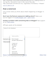
 One of the most common complaints about Blogger’s comment form is that it’s on a separate page from the post, styled in a way that doesn’t match the blog. Our new embedded comment form addresses that by putting the comment form where your readers expect it: at the bottom of the post.
To turn on the embedded comment form, log in to http://draft.blogger.com/ and go to Settings > Comments for your blog. You’ll see that the “Show comments in a popup window?” setting has been replaced with the new “Comment Form Placement” setting. Just click “Embedded below post,” save your settings, and go check out a post to see your new comment form.
Additional Features
- The comment form works with Google Accounts, OpenID authentication, name / URL, and anonymous identities. As with the current comment form, we’ve set up shortcuts for a handful of common OpenID providers.
- Once you log in with a Google Account for one blog, you won’t have to log in to comment on other blogs during your browser session. Nevertheless, to protect your privacy, we use an <iframe> to keep your logged-in identity inaccessible to the blog itself.
- If you have a “Comment Form Message” set up, we put it on the post page above the comment form.
- If you require word verification for commenting on your blog, we’ll show the word verification form in a small dialog after you click “Post Comment.”
- Update, 6/27: The embedded comment form works with Classic templates. The <$BlogItemCreate$> tag will add the right HTML to your page.
- If you’ve edited your template for the blog widget, you won’t automatically pick up the new code for the comment form. You’ll need to either reset the template by deleting the contents of the <b:widget id='Blog1' locked='true' title='Blog Posts' type='Blog'> element (backup your template first!) or copy the code from an unmodified blog. Update, 6/27: Amanda from Blogger Buster has written a howto post for updating a modified blog widget template.
- The font color of the comment form is currently hard-coded to black. If your template has a dark background, this may make the “Comment As:” label hard to read.
- The embedded comment form currently does not support subscribing to follow-up comments via email, nor does it have a preview button.
Let us know in the comments, now with convenient embedded comment form technology.


No comments:
Post a Comment